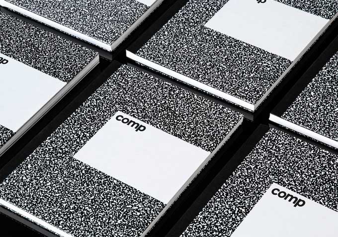
The ubiquitous black and white composition notebook has a long and often illustrious history, but the design hasn’t changed much over the 180 or so years they’ve been around. The paper is thin, and they’re hard to lay flat to write in them. They’re economically built to serve a utilitarian purpose — high-end notebooks they aren’t.
That may be about to change. Aron Fay, a graphic designer at Pentagram Design in New York City has painstakingly set about reimagining the composition notebook to “to create a notebook that uses new printing and binding technologies and the highest quality materials possible while still maintaining the nostalgic pattern that we all know and love.”
The result is Comp, seen below. This new version of the composition notebook is now a Kickstarter project. Office supply nerds and design fans alike will delight in reading the history of the composition notebook and everything that went into the beautiful redesign. Check it out, and order a couple, over on Kickstarter.


